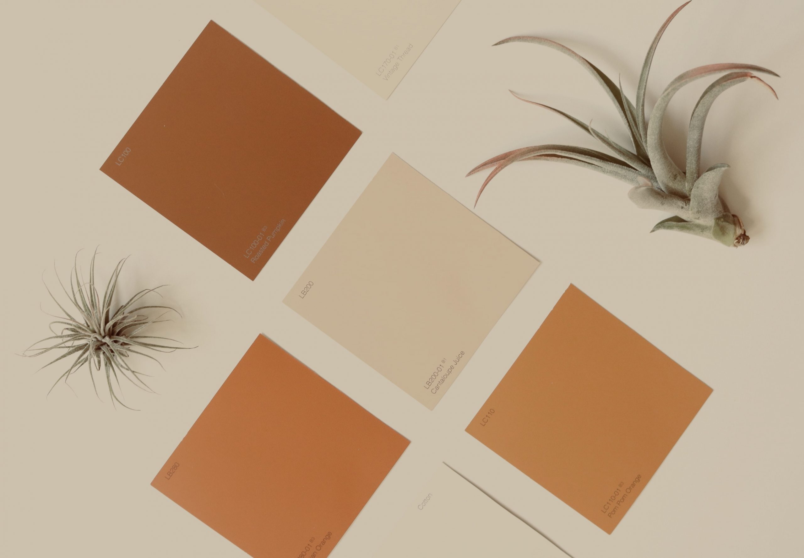
Colours are seen as a visual language that is communicated through interior design. It is also used in ways that evoke emotion, moods and personality in a home.
For many designers, it is a thoughtful process of getting to know a client, to ensure that they choose colours for the intended atmosphere wisely. For example, some people may choose to design a lively and bright living area whilst going for a mellow and neutral palette in the bedroom.
Each tone has a significant effect on how it interlinks with our mind and how we feel, according to many psychologists.
BROWN
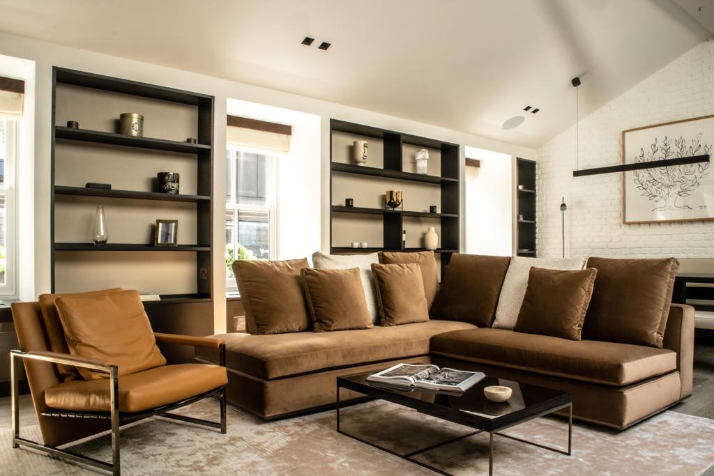
The colour brown brings a sense of security and stability. It works very well with neutral colours such as beige and black. Shades of brown show fine taste and is often incorporated on furniture finishings and sleek wooden flooring.
WHITE
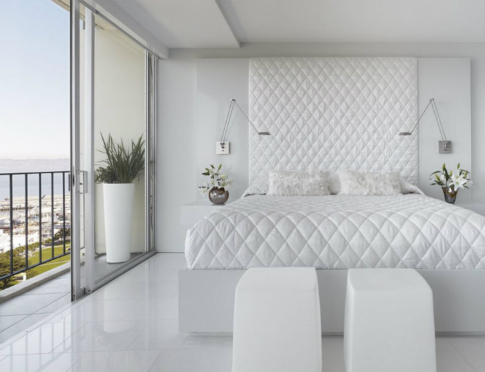
The colour white has a pure, airy and quiet appearance. With its invigorating freshness, using white on the walls or flooring can make a space seem bigger than it is. See above for an example of how much it can truly open up a room.
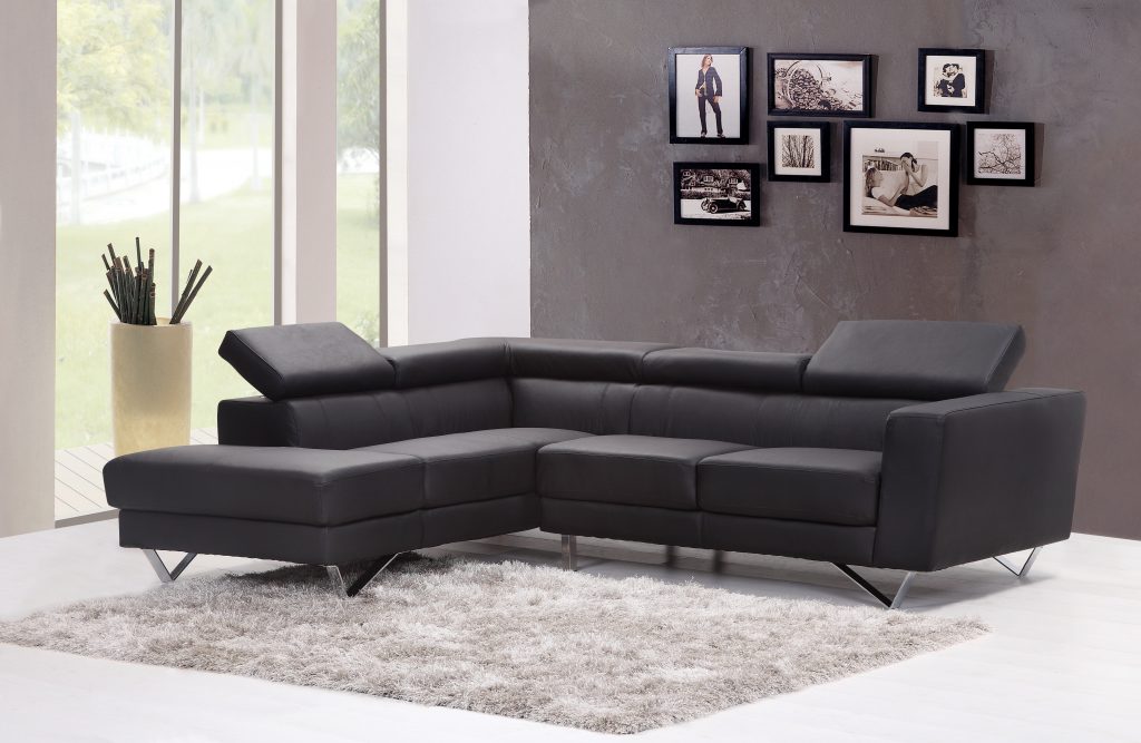
BLACK
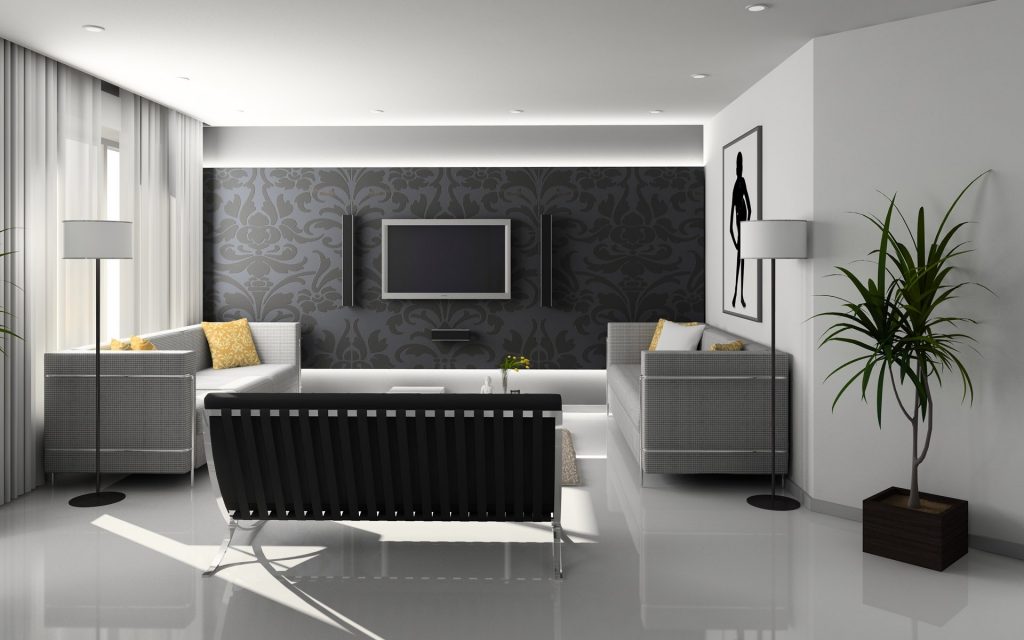
Black is a colour that is associated with elegance and sobriety, or it is used in small doses around a room. The image above shows elegance in a very modern setting. It is a colour that you can also use with contrasting accent details.
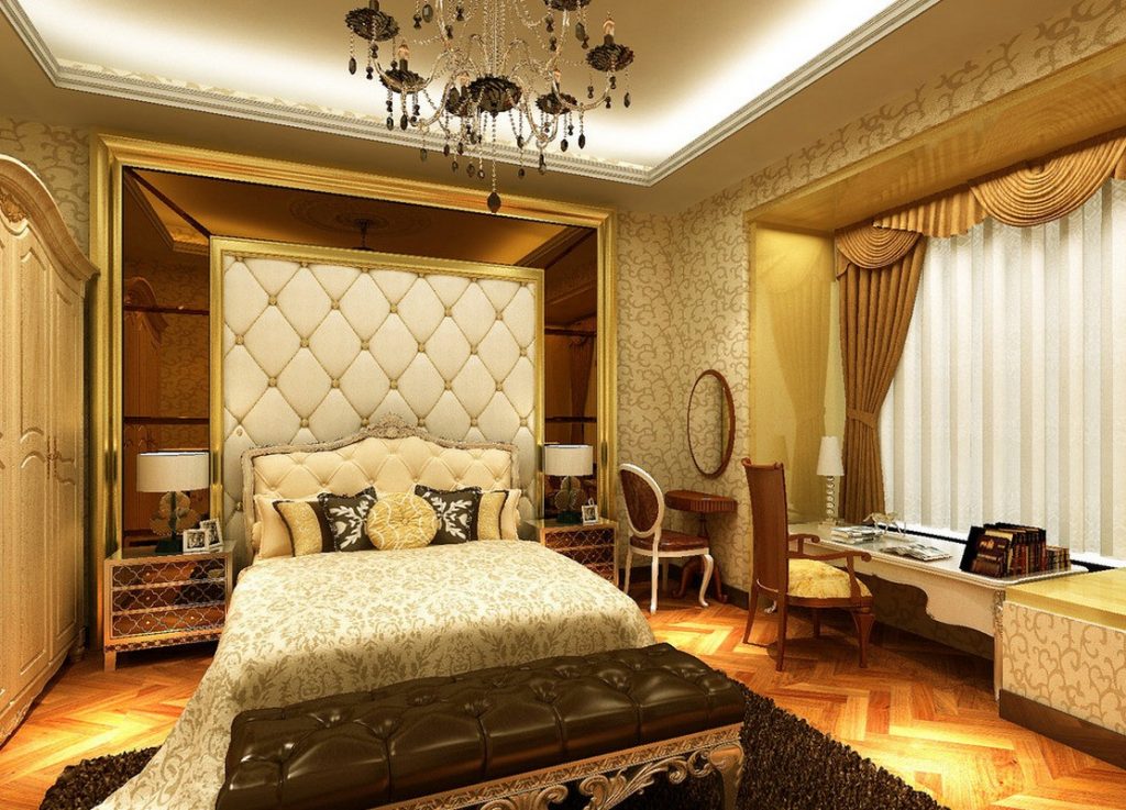
GOLD
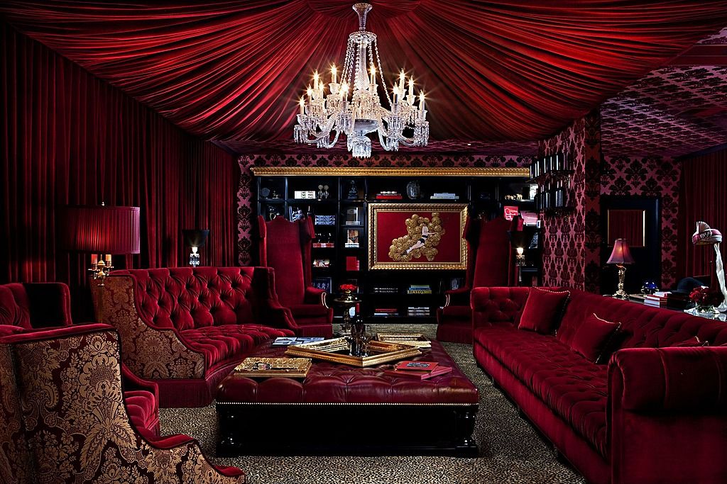
RED
Red is energising and exudes a strong and powerful energy. Just like it is a colour that warns you from danger and demands attention, the same goes for interior design. Those who love the colour red are full of energy and passion.
GREEN
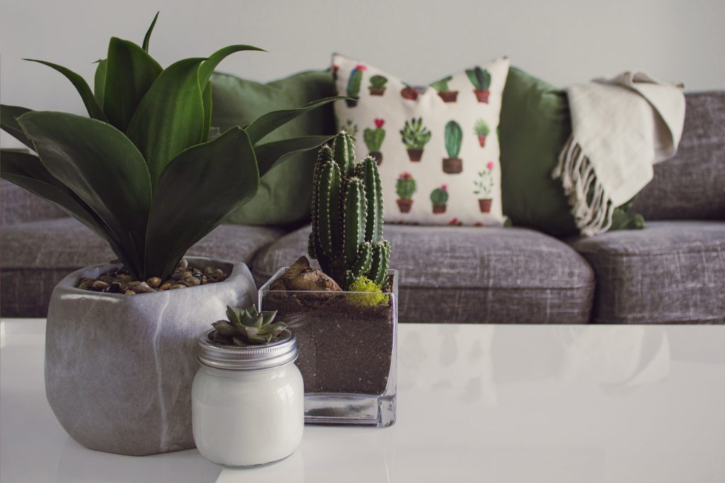
Green reminds you of a nature, growth and harmony. It is a sanctuary away from the stresses of everyday living. For example, using indoor plants to add greenery in your home or using lighter green shades to enhance freshness in your decor.
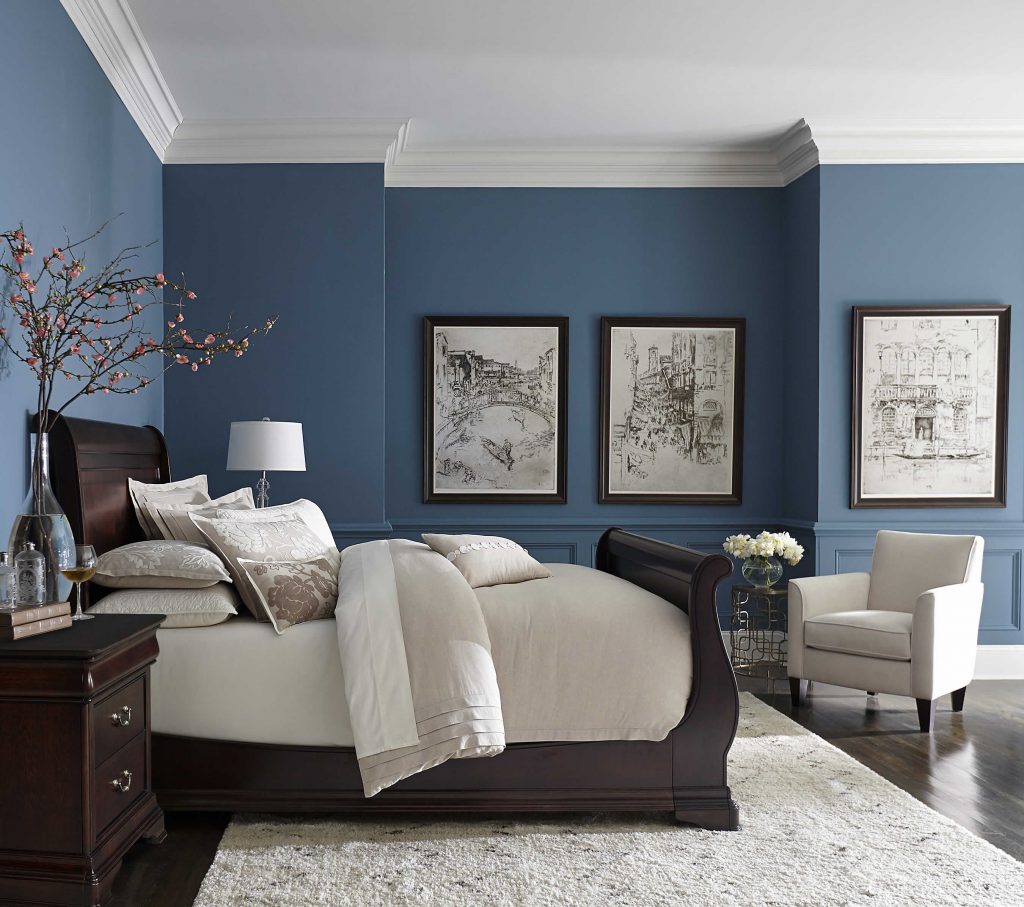
BLUE
When you look at blue, can you really think of anything negative? Probably not. Blue is the colour that exhibits trust, maturity, inner security and confidence, which is why blue skies can give anyone a good feeling.
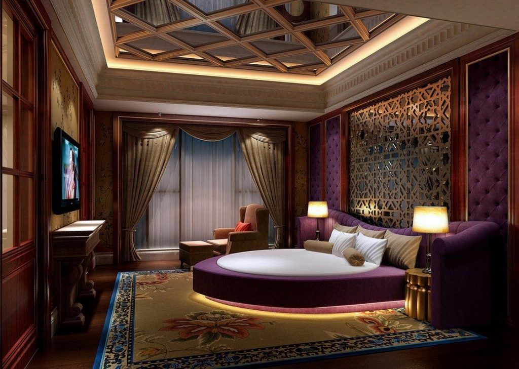
PURPLE
Purple is a very imaginative and spiritual colour. It can add an exotic flair to a room. For example, using darker tones of purple on walls evoke a sophisticated and vibrant personality.
GREY
It gives a formality that is subtle and elegant – without being too conservative. It is a very easy colour to play around with and works with just about any colour. Working with different shades will avoid a room looking too bland.
The psychological principle known as the Isolation Effect states that an item that “stands out like a sore thumb” is more likely to be remembered. So for better results, you do not have to constantly match items in a room with the same colour. Be sure to make items stand out and use contrasting colours for the final touches.
Colours and designs in homes should reflect the people who live inside, and designers should take the time needed to make sure a client’s brief is well understood.